
Infographics turn complex information into visuals that people actually want to look at. They're used everywhere: data visualization in reports, process infographics explaining how things work, timeline infographics for history, and flowcharts for decision-making. The challenge is that traditional infographic tools like Canva, Piktochart, or Venngage require you to manually arrange design elements, choose fonts, and build layouts from infographic templates.
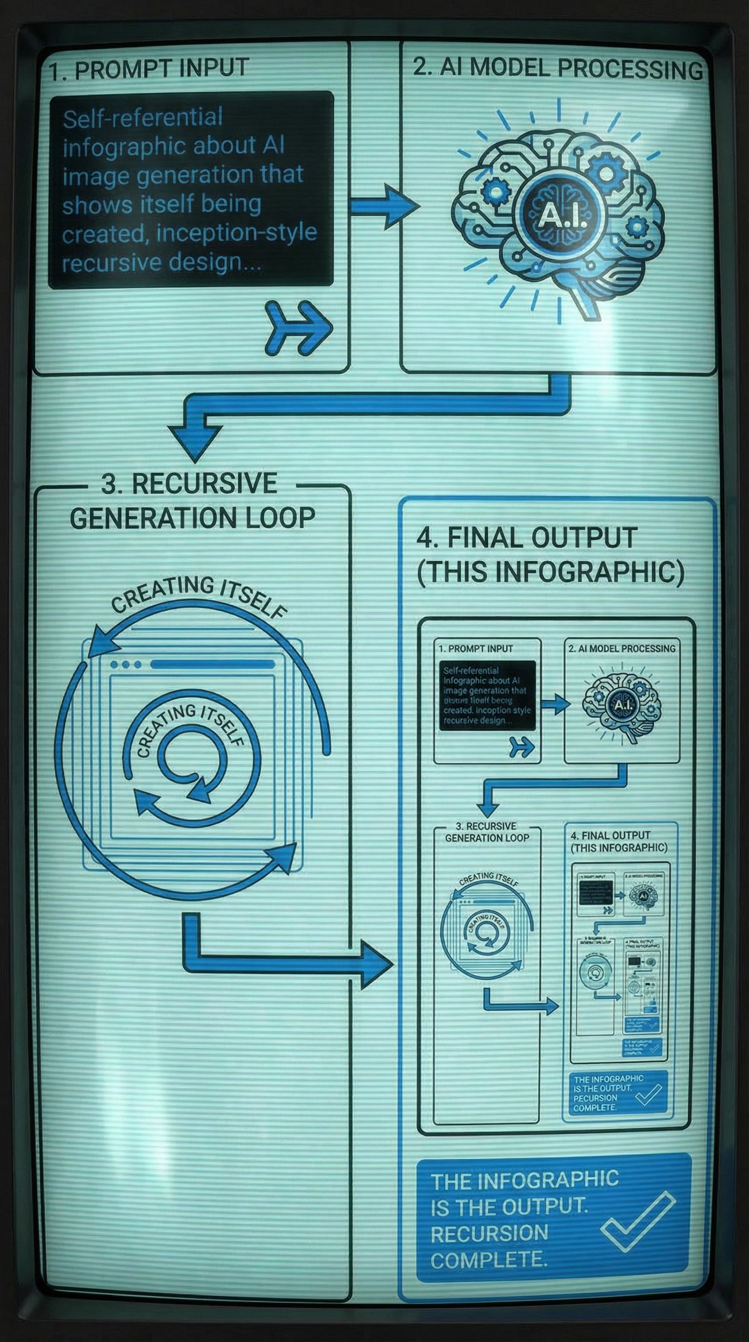
AI offers a different approach. Instead of drag and drop assembly, you describe the infographic you want and generate complete designs. In this tutorial, we created something meta: an infographic that explains how AI generates images, where the infographic itself is the output. It's recursive, educational, and demonstrates the design process in action.
Types of Infographics
Before you create infographics, understand which format fits your content. The best infographics match their structure to the information they present.
Process / Flowcharts
Step-by-step explanations with connected nodes. Great for tutorials, workflows, and decision trees. Use when showing how something works.
Statistical / Data
Visualize datasets with graphs, pie charts, and bar charts. Best for research findings, survey results, and comparisons.
Timeline Infographic
Chronological events on a visual timeline. Ideal for history, project milestones, or evolution of a topic.
List / Informational
Tips, facts, or ranked items in a visually engaging format. Works well for "Top 10" content and quick-reference guides.
Step 1: Generate Multiple Concepts
A good infographic starts with exploring different visual approaches. Using AI image generators, you can quickly test whether your content works better as a technical diagram, an illustrated journey, or something more playful.
For our example, we created an infographic about how AI image generation works. The twist: the infographic shows itself being created, making it self-referential. We generated four distinct concepts:
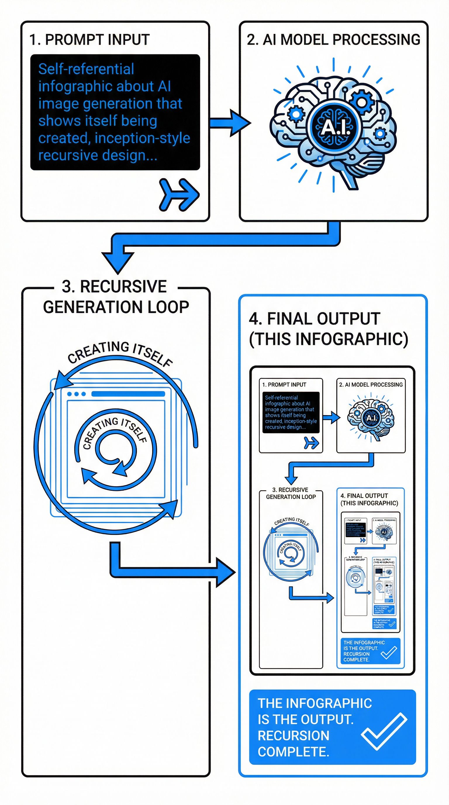
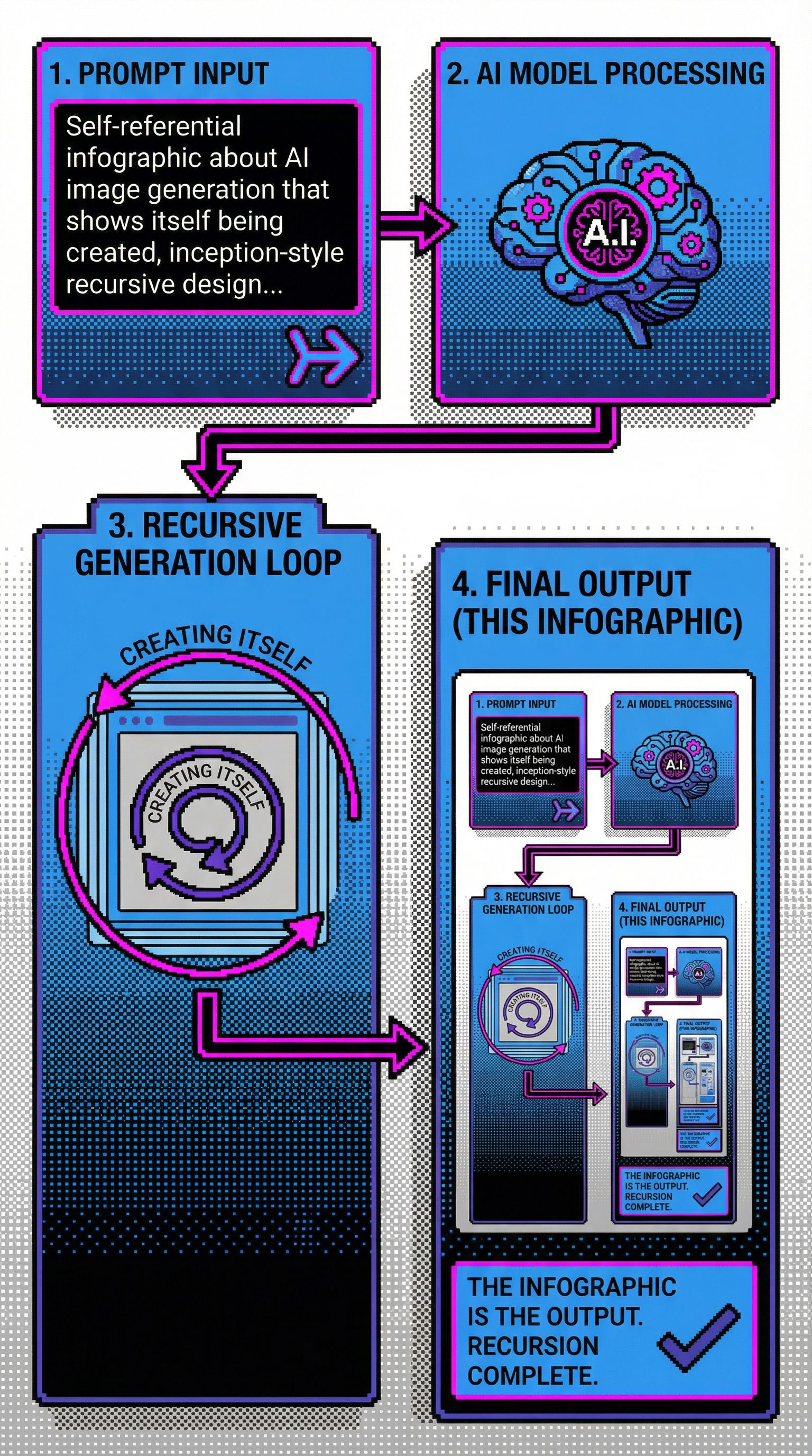
Self-Referential Recursive
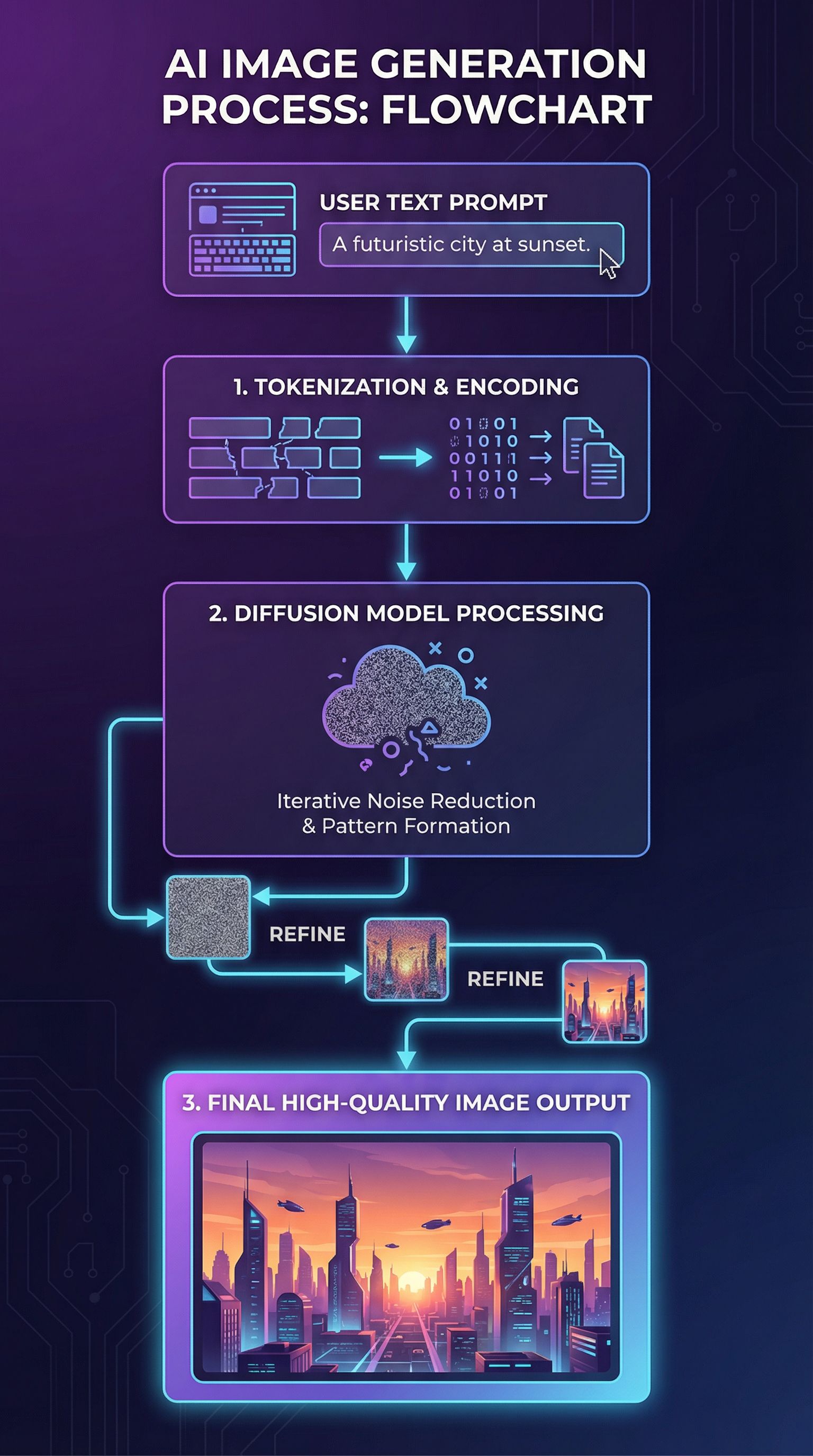
Modern Tech Pipeline
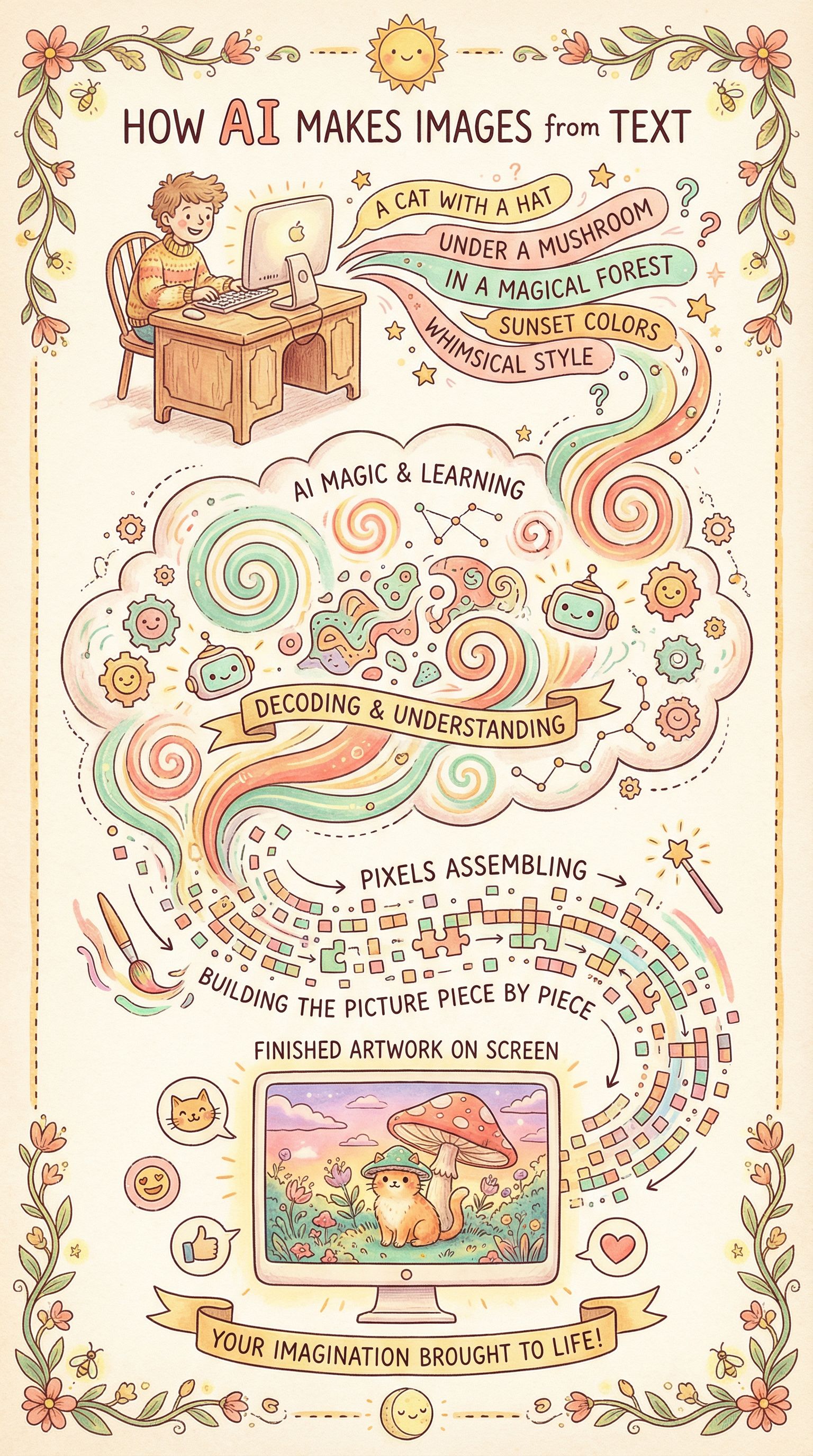
Whimsical Illustrated
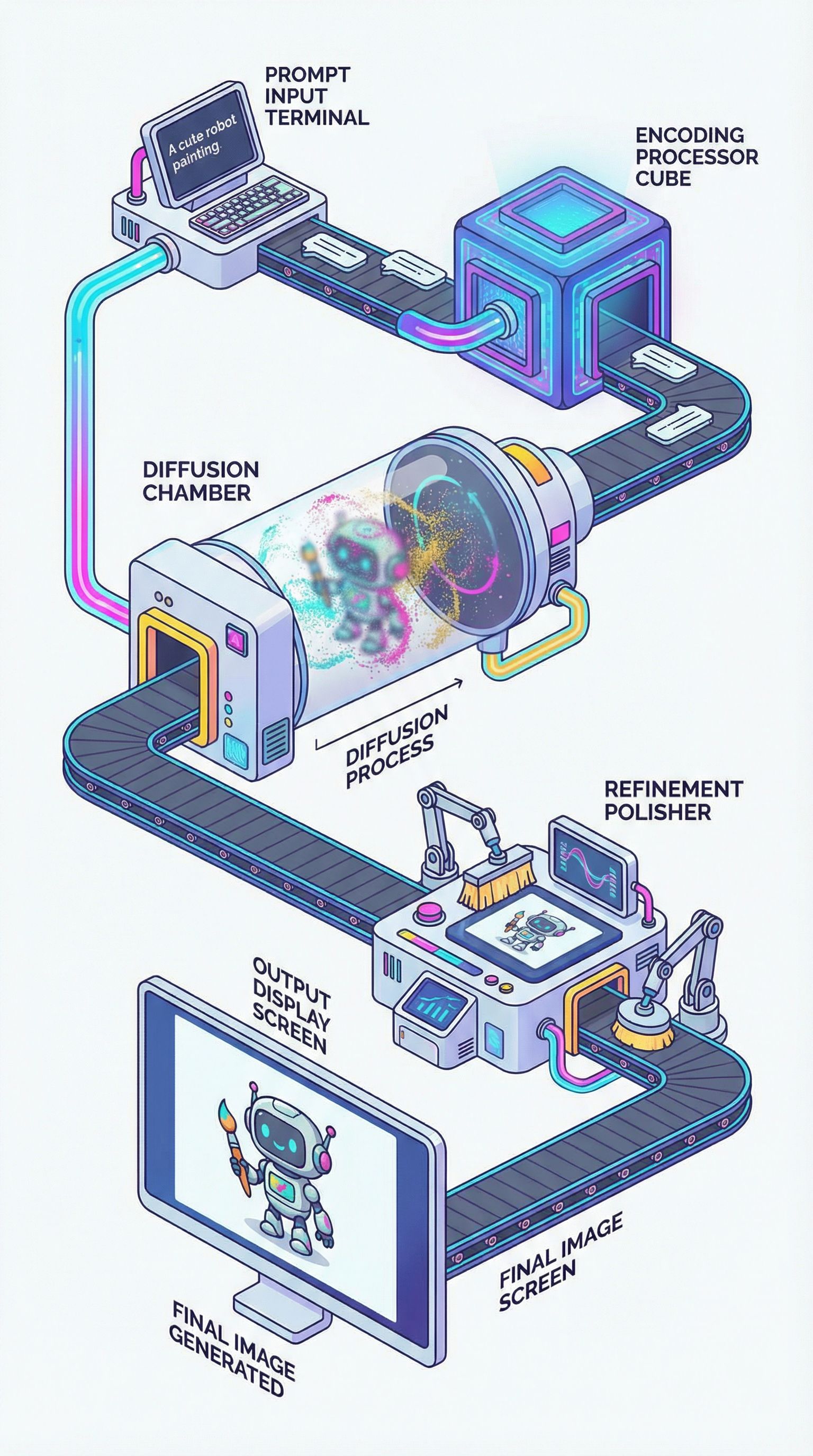
Isometric 3D Factory
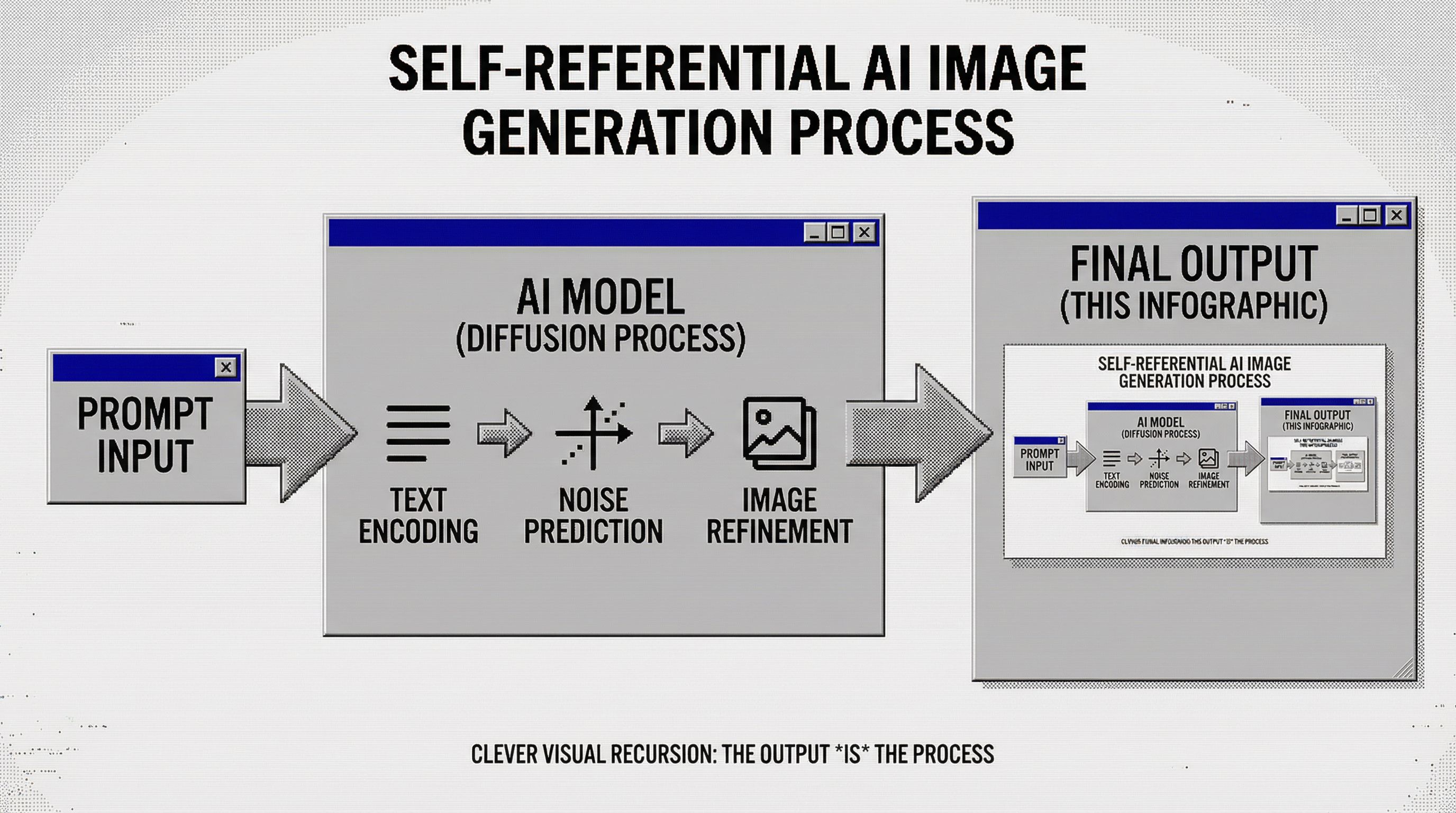
We selected the Self-Referential Recursive concept because it demonstrates infographic design while being genuinely clever. The final panel contains a smaller version of itself, creating an inception-style loop that captures attention and makes important information memorable.
Self-referential infographic about [topic] that shows itself being created, inception-style recursive design, the final output panel contains a smaller version of the same infographic, modern minimal style, flowchart from prompt to output, the output IS this infographic, clean black and white with one accent colorStep 2: Explore Style Variations
With your concept selected, experiment with different visual styles. This is where AI for graphic design becomes powerful. You can transform the same infographic into completely different aesthetics without rebuilding the layout.
We explored retro computing aesthetics to give our AI infographic a nostalgic twist:
80s Desktop Publishing
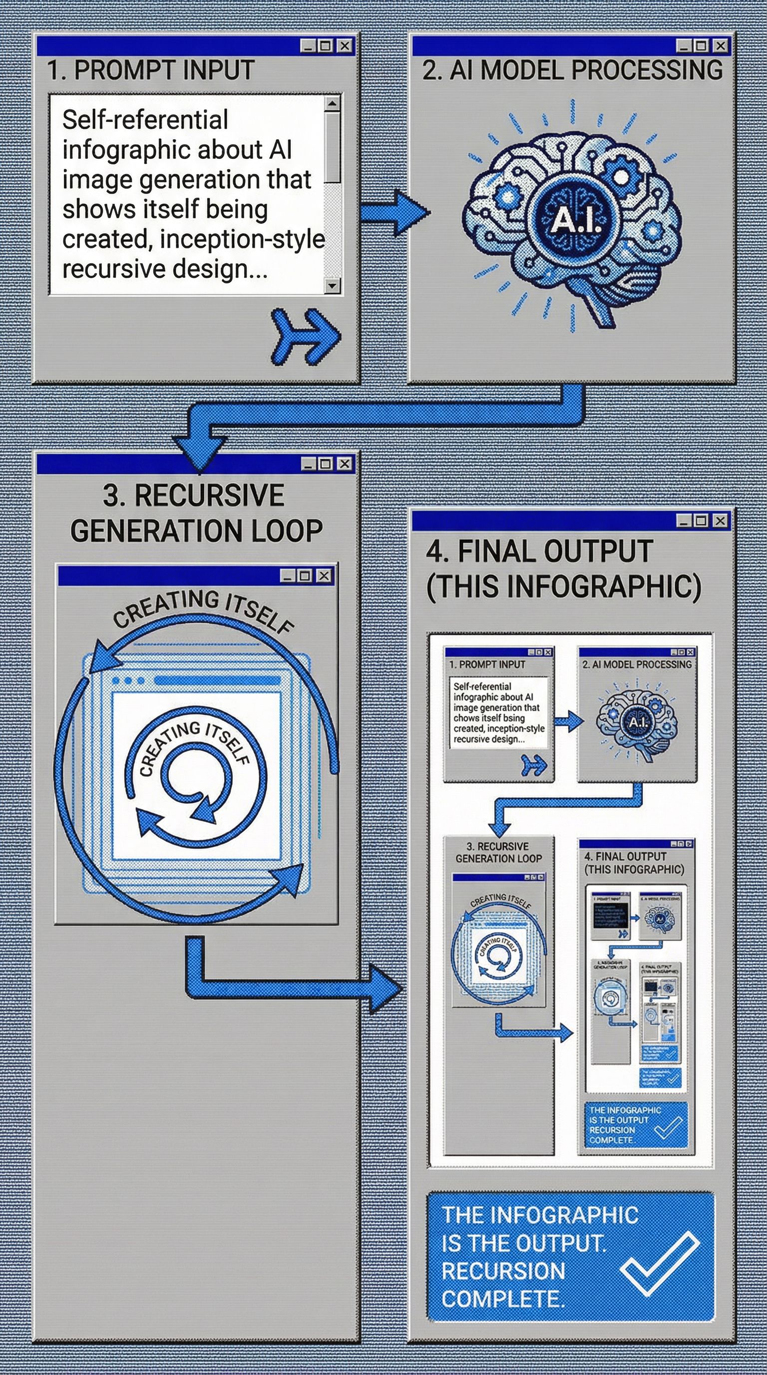
90s GUI Workflow
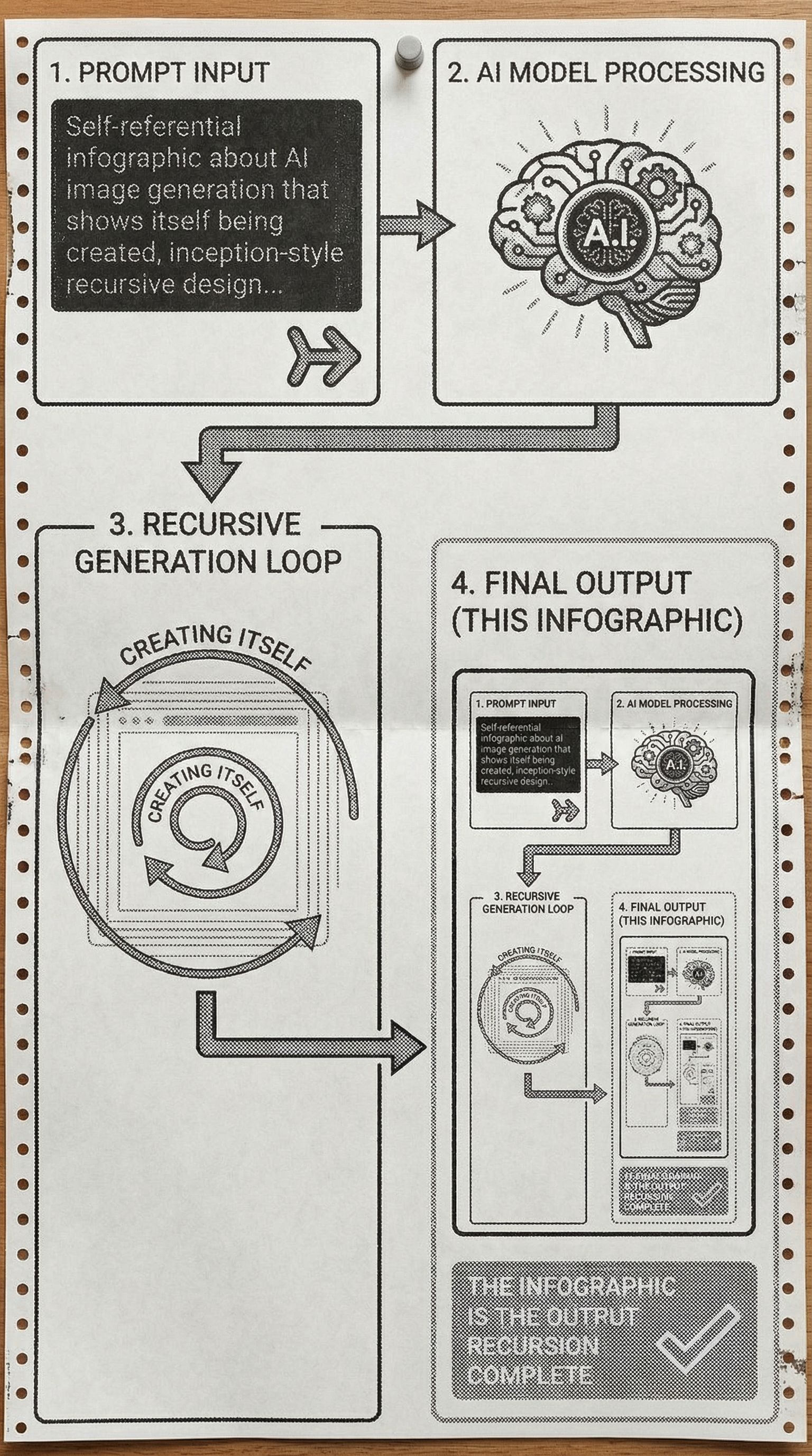
Dot-Matrix Printer
80s CRT Screen
Each variation maintains the recursive flowchart structure but applies a distinct color scheme and typography. The 80s Desktop Publishing style uses pixelated bitmap fonts and halftone fills. The 90s GUI version adds window frames with beveled edges. These transformations would take hours in traditional infographic tools like PowerPoint or Adobe Illustrator.
Step 3: Adapt for Different Platforms
An effective infographic needs to work across platforms. Social media platforms have different optimal dimensions. LinkedIn favors horizontal formats. Pinterest works best with tall verticals. Instagram carousels need square panels.
Common Infographic Formats
- Blog/Website embed: 800-1200px wide, vertical scroll
- Pinterest: 1000x1500px (2:3 ratio), eye-catching header
- LinkedIn: 1200x627px horizontal, professional tone
- Instagram: 1080x1080px squares for carousel posts
- Print/PDF: Letter or A4, high resolution (300 DPI)
AI can resize and adapt your infographic for each format. Export as PNG for web use with transparency, or JPG for smaller file sizes. For print materials and downloadable assets, generate at higher resolution.
FAQs
How does AI compare to Canva or Piktochart for infographic design?
Canva and Piktochart offer excellent infographic templates with drag and drop interfaces. They're great for beginners who want pre-built layouts. However, you're limited to their template library and stock images. AI generates completely original designs based on your specific description, including custom illustrations and unique visual styles you won't find in template libraries.
Can I use AI infographics for business presentations?
Yes. AI-generated infographics work well for business presentations, reports, and marketing materials. You can incorporate brand colors and maintain a consistent design direction. For data-heavy infographics with specific graphs or pie charts, you may want to combine AI-generated visuals with precise data from spreadsheet tools.
What makes a good infographic?
The best infographics have clear visual hierarchy, consistent typography, and a logical flow. They distill complex information into digestible pieces without oversimplifying. A good color palette guides the eye through the content. Most importantly, they tell a story that's easier to understand visually than as plain text.
Are there free infographic maker tools?
Traditional free tools include Canva (limited free tier), Piktochart, and Venngage. These offer free infographic templates but often watermark exports or limit features. AI infographic makers like Vondy let you generate original designs without template restrictions, though pricing varies by usage.
Can I add real-time data or animations?
AI generates static images (PNG, JPG). For real-time data dashboards or animations, you'll need to combine AI-generated visuals with interactive tools. However, AI is excellent for creating the visual foundation and design elements that you can then animate or connect to live datasets in other software.

Create Eye-Catching Infographics
All the AI design tools used in this tutorial are available on Vondy. Generate concepts, explore styles, and export high-quality visuals.
Start creating
Continue Learning